Artistaday.com - Find new contemporary art, create your own gallery of art

Andrew Meeder  Tampa, FL


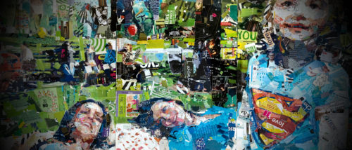
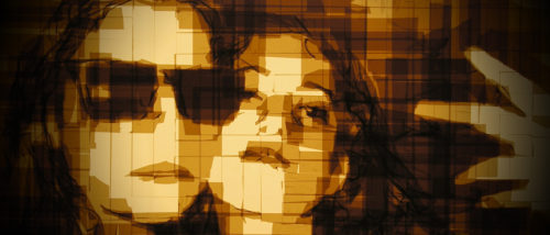
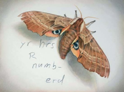
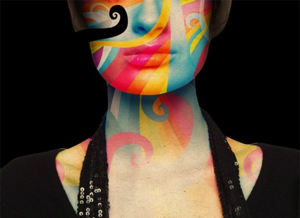
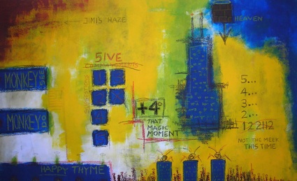
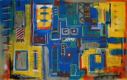
* All images used with permission. Please do not distribute without first contacting the artist.


About Andrew


My work was once comically described by a critic as ‘bipolar expressionism’, sometimes calm and peaceful, and other times angry and aggressive. My approach is a mix of multiple mediums on canvas that represent a very personal expression of ideas and emotions. I don’t believe in labored explanations of my work – that is for the viewers to decipher and interpret for themselves. There are no preconceived motifs, simply a recorded moment of ideas.


Follow Andrew


Andrew appears in the following Top 10 lists


'Florida'

'2008'


10 of 33 reactions displayed


"and basquiat looks like de kooning to me. there is nothing wrong with "looking like" another artist (particularly if it's a good artist--better to look like renior than repin, eh?). it takes more than two minutes and two paintings before determining an artists "steeze", especially in the current age. by the way, i think the stuff is pretty good."

"Sure, Basquiat used primary colors, black and white chalk, words and stuff. So apparently does Mr. Meeder, but there are some really, interesting i-dunno-what-you-call-its going on.Who is Ms. Smith and why is she at war? Are their faces in the walls? Or not? And high 5ives? Do you have eighteen more seconds to look at a work of art?I do. So get back under the desk. Or go to see http://www.curtiswmoore.com/ for work that uses a different palette."

"Every time I see a painting like this I can't help but think it's a Jean-Michel Basquiat impersonation. The work itself is not bad.It's good to have influences, but you have to develop your own voice."

"Inspiring and conceptual.reminds me of situationism. wonderful work...!"

"Amazing sense of texture, you can really see what you are trying to say. looking closely at the little pictures the story developes into a big picture!"

"Not my favorite. It is to "preschool kid scrible type". Yet it stays with the style of the 21st century and could've been very hard to do. As i said it is not my favorite but it is "OK"."

"this is totally basquiat, and this is not a close-minded thing to say, he writes words, crosses them out, draws buildings "primitively" uses the same colors as basquiat... And his website is really corny!!! you should look at it, it's hilarious.this guy needs to create his own steeze."

"The nicest thing I can say about this artwork is that it looks like something a preschooler would do. Rated it 1-star."

"i don't see how you could possibly talk about this without referencing basquiat. lame."

"In a word, I would say Monkey... I love how the boxes with numbers inside make me feel like I am inside an elevator - instantly claustrophobic, and humming along with no concept of the post-apocalyptic backdrop. The color scheme of the bottom piece instantly reminds me of bad Iroquois art - no idea why. I think it's great; Stanley and Tchock-like."


Previous artist


artistaday instagram artistaday pinterest